On this page:
- A summary of the core idea [2]: Combining the use of card/pile sorting and network visualisation software
- How to build and explore collective categorisations of qualitative data [3], sourced from multiple participants
- Piles of self-categorised stories [4]
- References to related work [5]
The pre-2018 version of this web page had a different structure and some of the older content is no longer shown here. The older version can be seen in this pdf [6]
1. A summary of the core idea
Problem: How do you aggregate large amounts of qualitative data, in a way that does not destroy the interesting details, and/or prematurely impose your own interpretations on the data ? E.g as we often do by counting and/or cross-tabulating frequencies of references to types of things or events of specific interest to ourselves as researchers/evaluators.
Assumption: If we are able to develop better representations of complex bodies of information then this will provide us with more informed choices about how to respond to the content of that information.
The core idea: A combination of two methods can help us aggregate and analyse qualitative information in a way that is participatory, transparent, and systematic.
The two methods are:
1. Pile sorting / card sorting: A simple participatory method of eliciting people’s tacit knowledge, especially the way they categorise people, objects, events etc
2. Social Network Analysis (software): A systematic means of aggregating, visualising and then exploring relationships between people, objects, events
Linking concept: When people categorise people, objects, events, etc, they create relationships between those events. Two or more entities in the same category can be seen to be related to each other, by that joint membership. And when they categorise objects they also add information to them, in the form of category labels or descriptions (a form of what Dave Snowden calls self-indexing).
Like many apparently new ideas, someone else had explored this territory before me, so I subsequently discovered. Notably, Steve Borgatti, a long-standing and widely recognised expert in social network analysis. See for example: http://www.analytictech.com/borgatti/etk3.htm [7]
2. Building and exploring collective categorisations of qualitative data
A. Pile sorting
Pile or card sorting is a very simple exercise, where participants are asked to sort a set of objects into groups, on the basis of their similarity (i.e. the attributes that they share), as seen by the participant. Having done so, participants are then asked to explain what the objects in each group have in common. A label is then developed for that group, on the basis of that description.
The particular kind of sorting discussed here and in sections 2 is “open sorting” by multiple participants, who are given a common set of objects to sort into categories of their choice. Open sorting means participants are allowed to sort the set of objects into any number of categories, as they see fit. In section 7 a different application of the same basic idea is explained, using closed sorting.
The process of pile sorting can be made more participatory if the objects themselves are generated by the participants, prior to their briefing on the sorting exercise. Participants representing different stakeholders are asked to brainstorm a set of ideas, each of which is written on a filing card, or Post-It note. These cards could describe their views on, for example:
- Possible objectives for a project (if the focus is on planning),
- Impacts of the project that have been noticed so far (if the focus is on evaluation)
With small groups sorting could be done by individuals. With larger groups, it may be more appropriate to have sub-groups (representing different interests) do their own joint sorting exercise.
Sorting exercises can be done in workshop settings, or online, using services such as OptimalSort [8]. Online sorting can be efficient in terms of use of time, but opportunities are lost to discuss with the participant their experience of the sorting exercise and their rationale for the completed sorting.
PS1: I have set up a seperate post [9] on references and resources on card sorting
PS2: How is pile sorting different from tagging [10]? (a) Tags are usually only one or two words long, whereas descriptions given in pile sort exercises can be whole sentences or longer. The qualitative data is richer; (b) The same tag may be applied to various items at different points in time, and as a result it’s meaning may vary each time. Descriptions given during pile sorts are given to a set of objects at the same time. There is likely to be more consistency of meaning.
B. Network analysis of card sorting results
Data entry
Here is an example of an almost completed card sort, taken from the OptimalSort [11]website mentioned above. The original unsorted pilot cards on the left and in the middle and on the right are the sorted piles, including one pilot hasn’t yet been labelled..
The next step is to convert these results into a form that can be analysed by social network analysis software. My preferred software package is UCINET & NetDraw [12] , which was developed by Steve Borgatti et al. This conversion is done automatically on some online pile sorting services, but if you doing a pile sort manually with physical cards then you need to do this manually. I have set up a seperate web page [13] on the details of the data processing steps that need to be followed to generate each of the network visualisations shown below.
Network visualisation
Once you have results from a set of card sorting exercises, and imported them in the way described above, there three kinds of network visualisations that can be produced, showing three kinds of relationships:
1. Relationships between the sorted items
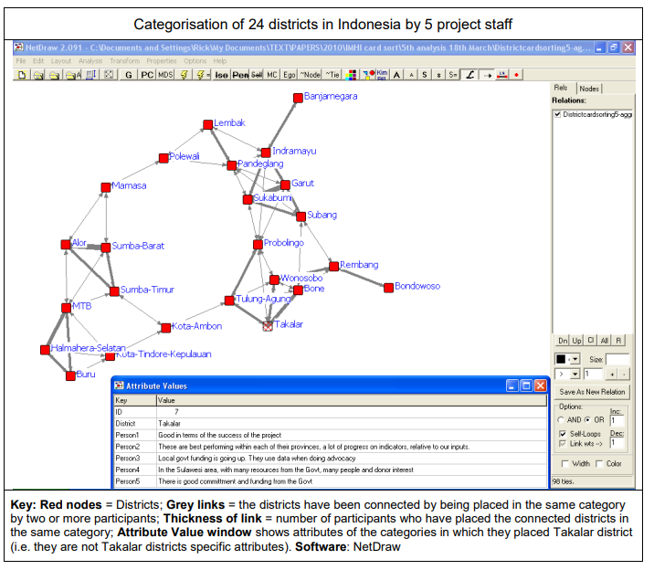
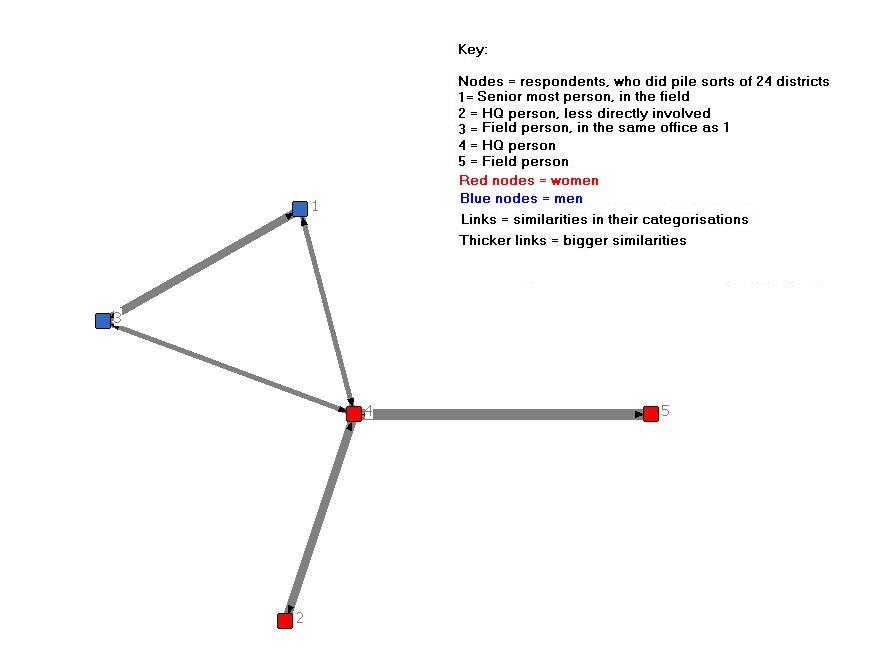
Example 1: A network diagram [14] showing similarities between 24 districts in Indonesia as separately pile sorted by 5 staff members of a project working in all those districts.
 [15]
[15]
Items that have often put in the same piles by different respondents are shown with strong (thick) links. In other words, they are often seen as having the same characteristics.
Groups of items with similar characteristics are visible as cliques or clusters of items. For example, Alore, Sumba Barat and Sumba Timur. It could be useful to ask the pile sort participants to look at such clusters and identify any characteristics which are common to all members of the cluster.
Items that were categorised differently by different respondents have weak links and are more likely to be on the periphery of the network.
2. Relationships between the categories used to describe them
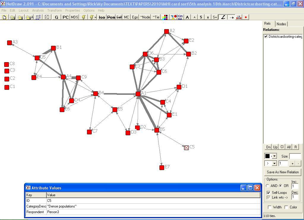
Example 2: A network diagram [16]showing the similarities in the categories used by the 5 staff members, to classify the 24 districts.

Categories that have many of the same items as members are shown to be strongly linked. For example, in this Indonesian project example [17], the A4 category label was “These are remote areas” and the C9 label was ” Islands, you need boats to get there. Small populations, different coping mechanisms” Frequently shared categories tell us about common concerns
Categories with few shared items as members are shown as having weak or non-existent links. For example, those on the top left of the network diagram. These may be of greater value because they are telling us something that other categories don’t.
3. Relationships between the participants who sorted them
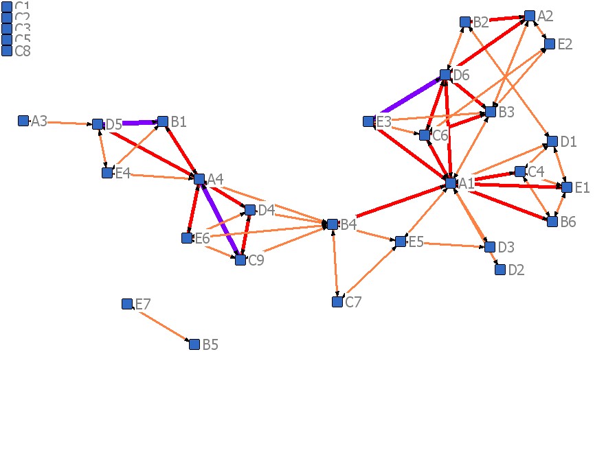
Example: A network diagram [18]showing the connections between these 5 participants, arising from similarities in the way they categorised the items

Participants who have categorised many of the items in the same groups are shown as having strong links. PS: In the example above, [18] there seem to be more similarities between gender than across gender of participants. There are two clusters, of men and women.
3. Self-categorised stories as piles
When people tell stories, during the use of a Most Significant Change [19] process or through other means, they can also be asked to self-classify those stories. You can see this as one of the options built into the use of SenseMaker® [20] in Kenya, (described in Cognitive Edge’s Final Report [21]of their work there with GlobalGiving [22]). Respondents were given 12 categories to choose from and asked to select three which they think were most relevant to their story (See page 15 of the pdf). You can see the same approach built in to this draft online survey [23], I prepared to enable a Dutch NGO to collect MSC stories from their grantees’ stakeholders. In this second example, there is an extra step (Question 3), where the respondent also generates their own headline for the story. This headline is effectively their unique descriptor, for a story that fits the specific combination of categories they have chosen.
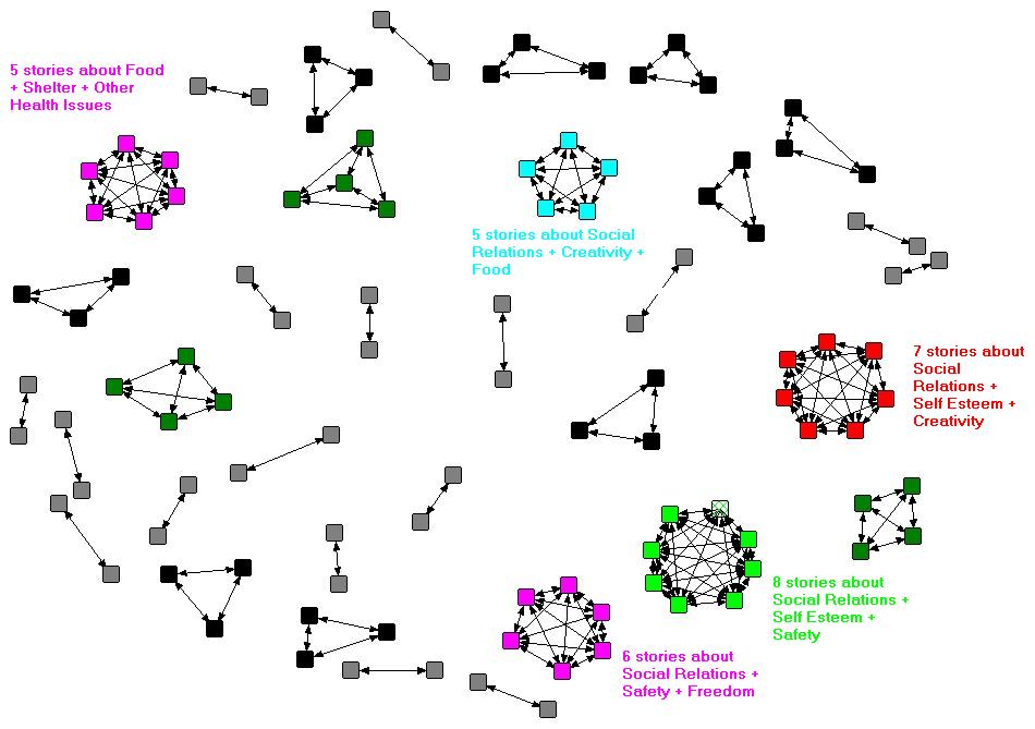
This self-categorisation data can be summarised in a “two-mode” matrix in Excel, showing listed stories x listed categories that apply to them (as seen by respondents). Using Ucinet [12], this matrix can then be converted into two kinds of “one-mode” matrix, showing: (a) how specific stories are connected to specific stories, by being given the same set of categories, (b) how specific categories are connected to specific categories, by being applied to the same set of stories. Both these matrices can be visualised as networks, using NetDraw [24]. The following network diagrams use data from a sub-sample of 195 of the 3000+ stories collected in Kenya by Cognitive Edge. The first diagram shows stories that are connected to each other by having three shared categories. Each cluster of stories is connected by a different and specific set of shared categories (NB: If they were the same categories they would all be in one cluster).
The point of this exercise is that the combination of self-categorisation plus network visualisation enables the stories to be self-organised into groups which are likely to share some commonalities of content. These groups would not be easy to find simply by a directed search for different combinations of categories because the number of possible combinations of 12 categories (in pairs, triplets, and larger groups) is very large (see more on this below). Click on the image (twice) to fully enlarge it.
 [25]
[25]
Using NetDraw it is possible to click on each story node in the original network diagram and identify its contents, as summarised in its title. These could also be displayed in the above network diagram, but that would produce a very crowded picture.
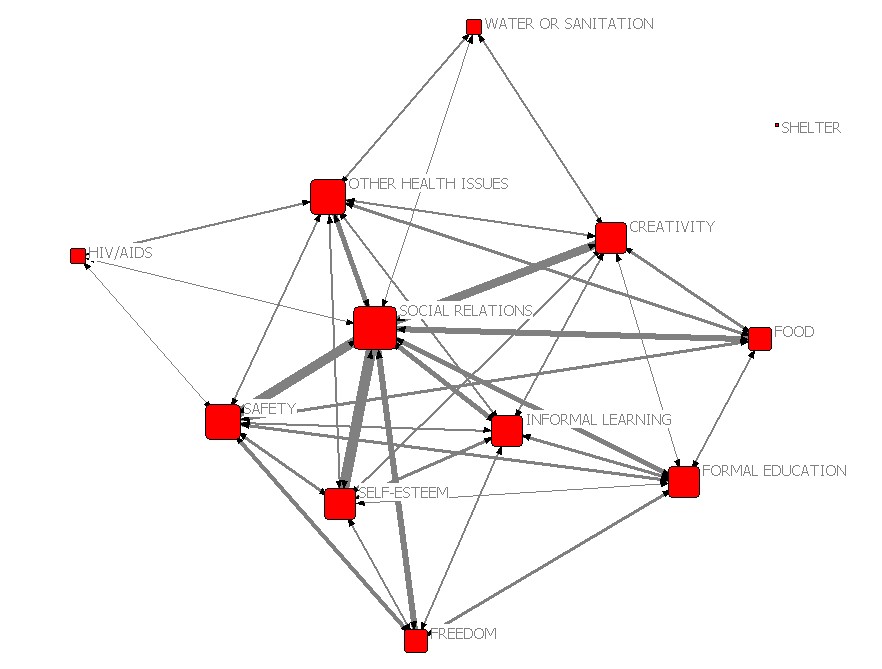
The second network diagram below shows how the 12 categories on offer were connected, by being applied to the same sets of stories. Only the above average strength connections (i.e. above the mean number of shared stories) are shown. Categories on the opposite sides of the network e.g. HIV/AIDs and Freedom, Water or Sanitation and Freedom, usually applied to quite different sets of stories, whereas categories in the center were often applied to the same sets of stories.
 [26]
[26]
The attached paper ( Scale and categories: Exploring different options for self-signifying stories [27] ) reviews the different options within the SenseMaker® software suite (as used in Kenya) for securing self-descriptions of stories provided by respondents. Two of the three kinds of options discussed in the paper can also be incorporated into easy-to-design online survey instruments available via third parties like SurveyMonkey.com [28]. These are the use of multiple categories (discussed above) and simple bipolar scales. Social network analysis software can then be used to analyse the data that is generated. Services like SurveyMonkey.com also have a valuable additional function whereby participants can access and search the aggregated survey results, including filtering of responses according to any of questions, and types of responses to those questions. So, for example, one could search for all stories given both category X and category Y.
As suggested above, such “directed” searches do have their limitations. The number of possible combinations of categories escalates dramatically as the number of available categories increases. They double each time an additional category is added. So where twelve categories are provided there are 4096 possible combinations (of singles, doubles, triples (etc up to 12) combinations of categories!! Even where respondents are told to only use up to three categories out of the twelve there are still 2573 possible combinations!! The details behind this calculation are available in this spreadsheet [29]. Looking for clusters of stories within such a big combinatorial space is therefore like looking for the proverbial needle in the haystack. Fortunately, this where the network software is so useful. With Netdraw you can set filters to find all stories connected by 1 or 2 or 3, etc shared categories. The diagram above shows all stories connected by three categories of stories.
There is another positive side to this unexpectedly large number of combinations of categories. Though we might be providing only a dozen pre-defined categories, respondents can by careful choice of combinations of categories produce quite specific descriptions of their stories. What initially looks like a Procrustean bed [30] ends up looking more like a five-star hotel.
PS1: On the implications for the use of the Most Significant Change technique [19]: MSC involves a social process wherein there is a reflection on a variety of changes that have taken place, the selection of the most significant of these, and the retention of that choice for wider use. When a number of those retained choices are pooled, variety is re-created, and a new selection can be made amongst these, in order to find and retain changes which have wider significance still.
The selection process requires people to read and discuss a small set of stories, usually no more than ten because it is difficult to understand and compare a large number of different stories. In this context, it matters how those groups of stories are put together prior to discussion and selection. In the original use of MSC in Bangladesh, stories were placed in one category or another, which were based on the NGO’s four main concerns (changes in quality of people’s lives, changes in sustainability, changes in people’s participation, and any other changes). These were mutually exclusive categories.
Since then there have been many other approaches to grouping stories prior to selection. The network of self-categorised stories discussion above suggests two different approaches. The first is only slightly different approach and involves allowing respondents to classify their own stories using a number of non-exclusive categories. With this approach, a particular MSC story might belong to multiple categories and could even be selected as the most significant within each of those categories. That would not necessarily be a problem, in fact the story concerned might thus be identified as especially meaningful because of its multiple significances. The second is significantly different, which is to find and use emergent/self-organised groupings of stories, through the network visualisation described above. I suspect this has been done before on a modest scale in participatory workshops, where groups of participants were asked to read through and sort stories into groups they think have something in common. What is significantly different here is the scale on which it can be done, with hundreds of stories, something that impossible in via face-to-face participatory methods.
PS2: On the implications for grantee’s progress reporting to grant giving funds: Almost all grantees of funds from development agencies or foundations are required to provide some form of periodic progress reporting, using a standardised format. A radical alternative would be ditch almost all that reporting, except the most essential, and allow/encourage grantees to report any kinds of “significant changes” whenever they wanted to, and to classify those changes using a set of non-exclusive categories (as discussed above). If done via an online survey mechanism the same grantees could be given the right to search all inputted data from all grantees. A more sophisticated option, probably via a designed website, would be to allow the same grantees to provide comment, and provide a value rating, on any contents they do find (with their identity disclosed, to stop collusion). The same facility could also be given to their grant-making body.
4. References
My earlier explanations of this type of analysis can be found here:
- Reflections on Dave Snowden’s presentations on sense-making and complexity [31] (2009),
- A re-analysis of results of an objective identification exercise, for a bushfire prevention program [32](2007)
“I See How You Think: Using Influence Diagrams to Support Dialogue [33]” (2009) Newell B, Proust K. ANU Centre for Dialogue. The authors describe how they faciliate individuals to develop their own casual networks, then through discussion, create a new shared causal network. As they note, skilled facilitation is very important in this type of highly participatory process.
Assessing Local Knowledge Use in Agroforestry Management with Cognitive Maps [34] (2009) Marney E. Isaac , Evans Dawoe , Krystyna Sieciechowicz, in Environmental Management [35], Volume 43, Number 6. The authors interviewed 12 individual cocoa farmers to establish their views of the causal steps, and linkages between them, that connected up an initial step of “clearing land” to a final end point of “productive cacoa” or “less productive cacoa”. They allowed for emergent steps that may not be common for all interviewed farmers. However, key words were idnetified to represent common steps. Data was visualised by Decision Explorer software, but analysed using common SNA measures (e.g. number of nodes, links, density, degree centrality. Comparisons of farmers cognitive maps were made on these variables. They did not however generate an aggregate cognitive map, using the steps named and used by two or more respondents. They usefully differentiated between “ordinary variables (nodes) and “transmitter variables”, with the former has bi-directional links and the latter having outard links only. The latter were seen as factors out of the control of the farmer, where as the former were seen as being within control. The status of some of the nodes were used as management indicators to guide decision making. They also note that “Amid complex decision making processes the similarity of the cognitive maps suggests a high likelihood of generaizing individual farmer management techniques. This similarity may be strategically beneficial for regional shifts in agrarian policy toward sustainable practices at the landscape scale”
Visualizing Proximity Data [36](2007) Rich DeJordy, Stephen P. Borgatti, Chris Roussin, Daniel S. Halgin, on the merits of network models versus multi-dimensional scaling (MDS) for analysing the results of pile sorts (described in the title as proximity data). They identified the potential well before I did. I have been more focused on its application.
Teen Photovoice Project: A Pilot Study to Promote Health Through Advocacy [37] (2007) by Jonathan W. Necheles, MD, MPH, Emily Q. Chung, MPH, Jennifer Hawes-Dawson, BA, Gery W. Ryan, PhD, La’Shield B. Williams, Heidi N. Holmes, Kenneth B. Wells, MD, MPH, Mary E. Vaiana, PhD, Mark A. Schuster, MD, PhD. This paper describes a network visualisation of pile sorting of photographs taken by participants. Two pile sorts were carried out. The first was an unconstrained pile sort, generating 41 categories (described as themes). The second was a constrained pile sort where the researchers seem to have predefined the common categories to be used by all participants, based on the results of the first sorting. The results of these piles sorts were then visualised as a two- mode network (group labels x items), and then shared and discussed with the participants. “Participants were asked to interpret the relationships between piles and pictures to foster a better understanding of how they perceived the pictures and themes.”
Recommending Collaboration with Social Networks:A Comparative Evaluation [38] (2003) by David W. McDonald. “A Successive Pile Sort (SPS) [4, 29] technique was used to collect the second social network. In this technique, the name of every member in the group is written on a card. Participants sort the cards using a high level rubric supplied by the researcher. Each participant is free to interpret the rubric in her own way. The first sort results in a number of “piles” which are, in turn, sorted using the same rubric. The level of the sort at which individuals or groups are broken apart indicates the connection weight between the members. The connection weights are aggregated across all participants to create an edge weighted social network” Participants were challenged to create sorts with the rubric “who hangs out together.” This rubric was designed to reveal the social structure rather than work context structure at MSC. Motivating the SPS collection by asking “who hangs out together” was one way to consider the more sociable aspect of interaction at MSC. Each participant required between 45 and 90 minutes to sort 47 cards.”
PS: 6th July 2010. In Social Network Analysis the term Cognitive Social Structures refers to social networks , as perceived by the members of those networks (or others). What has been described above is different and could be referred to by the term Social Cognitive Structures: i.e. the social structures created by overlaps in people’s cognitive structures (i.e. their classifications and causal relationships).
SenseMaker Demonstration Videos [39], on the Cognitive Edge website (2010)
- Collector site Walkthough [40]: “This video provides a guided tour of a SenseMaker® Collector website created for the GlobalGiving project. See how a SenseMaker® project signification framework presents online and how narrative fragments are entered and signified by respondents”
- Explorer – Distribute and Cluster views [41]: “This video shows the SenseMaker® Explorer Distribute and Cluster views for exploring narrative data collected with a SenseMaker® Collector website. This particular screen-cast shows how Distribute and Cluster views can be used to explore for patterns in signification data.
- Explorer – Triad and Cluster views: [42] “This video shows how triad distributions are created using SenseMaker® Explorer’s Cluster view. Creating visuals representative of triad distributions allows scanning of large volumes of narrative fragments (stories and other unstructured data) to quickly identify patterns from multiple perspectives.Rick on the Road blog
MandE NEWS postings
- Using stories to increase sales at Pfizer [44]: A commentary
Discourse Network Analyzer (DNA) [45]
- Larry Dershem brought this to my attention, it looks very relevant and related to all above. Here is a summary description of the software
- “DNA is a Java-based application for qualitative category-based content analysis. It serves two purposes: coding statements of actors into categories, and converting these structured data into networks that are readable by UCINET, visone and other network-analytic software packages. The software can extract either bipartite (affiliation) networks or adjacency networks. It is complementary to semantic network analysis applications because it neither relies on algorithms for automatic text processing, nor does it focus on the internal meaning or mental representation of a single text or document. Instead, tags are applied to the text data by manual inspection, thus rendering it more flexible, yet at the same time more work-intensive. DNA can be used to code a large body of text documents and then convert them into graphs. The application is currently being developed, tested and heavily used in my dissertation research project on German pension politics [46]. Updates will be posted here as soon as something has been published. If you use DNA, I would love to hear from you about your project. For more information about the software, please consult the documentation [47] or obtain a free copy from the download page [48].”
Postscript
- There has been some very interesting work done by Hidalgo and Hausemann on “product spaces”, described by Tim Harford in the New York Times (The Art of Economic Complexity: A new way to visualize a country’s development [49]) and by others elsewhere. Hidalgo and Hausmann have mapped the world’s “product space” using trade data on 774 product classifications, from cotton undergarments to phenols. Countries are in effect the same as piles seen in pile sorting exercises and products are what have been sorted. Different countries have different combinations of products in their “pile”. Products are closely connected on the underlying network if they tend to be exported by the same economies. Finding products which are near to each other in product space means there is a good chance that a country producing one might be able to produce the other. At the fringes of the product space are development dead ends. Better-connected nodes represent industries that offer promising prospects for growth.
- The first network diagram in the NYT is unfortunately wrong when it says “The underlying grey template represents the “product space” It is the structure of the links that represents the product space, products that are many links (i.e. degrees) in the chain away from each other are more distant in the product space.
Postscript 2018 06 03: The pre-2018 version of this web page had a different structure and some of the older content is no longer shown here. The older version can be seen in this pdf [6]
Postscript 2020 06 20: See Pokorny, J. J., Norman, A., Zanesco, A. P., Bauer-Wu, S., Sahdra, B. K., & Saron, C. D. (2018). Network analysis for the visualization and analysis of qualitative data. Psychological Methods, 23(1), 169–183. https://doi.org/10.1037/met0000129 PDF available here [50]